Quick Answer
Effective wayfinding design follows five core principles: visibility, simplicity, consistency, hierarchy, and accessibility. When applied together, these principles reduce confusion, lower stress, and create intuitive navigation through any building — from hospitals to corporate campuses to multifamily properties.
⚡ Key Takeaways
- Wayfinding signage should be visible from decision points — where visitors must choose a direction
- Consistent design language (colors, icons, typography) across all signs reduces cognitive load by up to 40%
- Hierarchical information — building → floor → zone → room — matches natural navigation patterns
- ADA-compliant wayfinding is required, not optional — tactile, Braille, and high-contrast elements

Why Does Wayfinding Design Matter for Commercial Properties?
Poor wayfinding costs facilities more than frustrated visitors. Hospitals with inadequate wayfinding see higher missed appointment rates. Corporate campuses lose productive time when employees can’t find meeting rooms. Multifamily properties receive more complaints and lower satisfaction scores when residents and guests can’t navigate the property.
What Are the 5 Core Wayfinding Design Principles?
1. Visibility at Decision Points
Signs must be positioned where visitors make directional choices — intersections, elevator lobbies, stairwell exits, and parking structure entries. A sign placed 10 feet past a decision point is functionally invisible.
2. Simplicity of Information
Each sign should communicate one clear message. Overloaded signs with too many destinations, small fonts, and competing information cause hesitation. Limit directional signs to 5–6 destinations maximum.
3. Consistency Across the System
Every wayfinding element — from parking garage entry to elevator lobby to hallway — should use the same color coding, iconography, and typography. Consistency builds subconscious trust. When the system looks the same everywhere, visitors trust it without thinking.
4. Hierarchical Information Architecture
Structure information from broad to specific: building → floor → zone → room. Building directories show the big picture. Floor directories narrow to a wing. Hallway signs identify specific rooms. Each layer answers the question the visitor has at that moment.
5. Accessibility as a Baseline
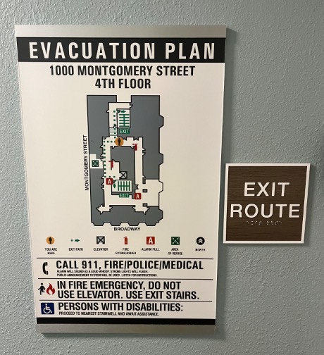
ADA-compliant wayfinding isn’t an add-on — it’s the foundation. Tactile room signs, high-contrast text, appropriate mounting heights, and Braille are required by federal ADA and California Title 24. Accessible wayfinding benefits everyone, not just those with disabilities.
Need a Wayfinding System?
We design, fabricate, and install complete wayfinding solutions for commercial properties across California and Texas.
How Does Powell's Approach Wayfinding Projects?
We start with a site walk — mapping every decision point, documenting traffic patterns, and identifying problem areas. From there, we develop a sign schedule, design concepts, and material recommendations. Everything is fabricated in-house and installed by our own crew, ensuring quality control from concept through completion.
Wayfinding Design FAQ
Ready to Improve Navigation in Your Facility?
Contact us for a free wayfinding assessment.
Related Articles